To effectively use color in web design, you’ll want to establish a visual hierarchy by using color contrast to draw attention to important elements, and incorporate bright, saturated colors for essential features. Next, create a harmonious color palette by balancing primary, secondary, and accent colors using the 60/30/10 rule, and consider color theory principles like Complementary, Analogous, and Triadic Colors. Finally, enhance user experience with contrast by leveraging high contrast for improved legibility and engagement, and test your design in grayscale to adjust contrast for accessibility. By mastering these techniques, you’ll be well on your way to crafting a visually stunning website.
Establishing Visual Hierarchy With Colors
To establish an effective visual hierarchy, you use color contrast to draw users’ attention to the most important elements on your website, making darker colors a crucial tool for highlighting key information.
By incorporating bright, saturated colors for essential elements, you’re creating a focal point in your design, guiding users’ focus where you desire it.
Consistency plays a significant role in creating this visual hierarchy, which is why adhering to a uniform color scheme across the website is necessary.
When using varying shades of a single color, you add depth and visual interest, helping users grasp the importance of each section.
Employing strategic color use throughout your website doesn’t only guide users to key information, but it also facilitates a smooth shift between each page.
Consequently, as you use strategic color choices, you influence users to complete calls-to-action through color contrast without overwhelming their senses.
For this strategy to be impactful, every aspect of color use and selection should support the web design’s specific goals by promoting visual communication and clear guidance for web users navigating your site, making finding key information stress-free, which is highly advantageous when establishing a seamless user journey.
Creating a Harmonious Color Palette
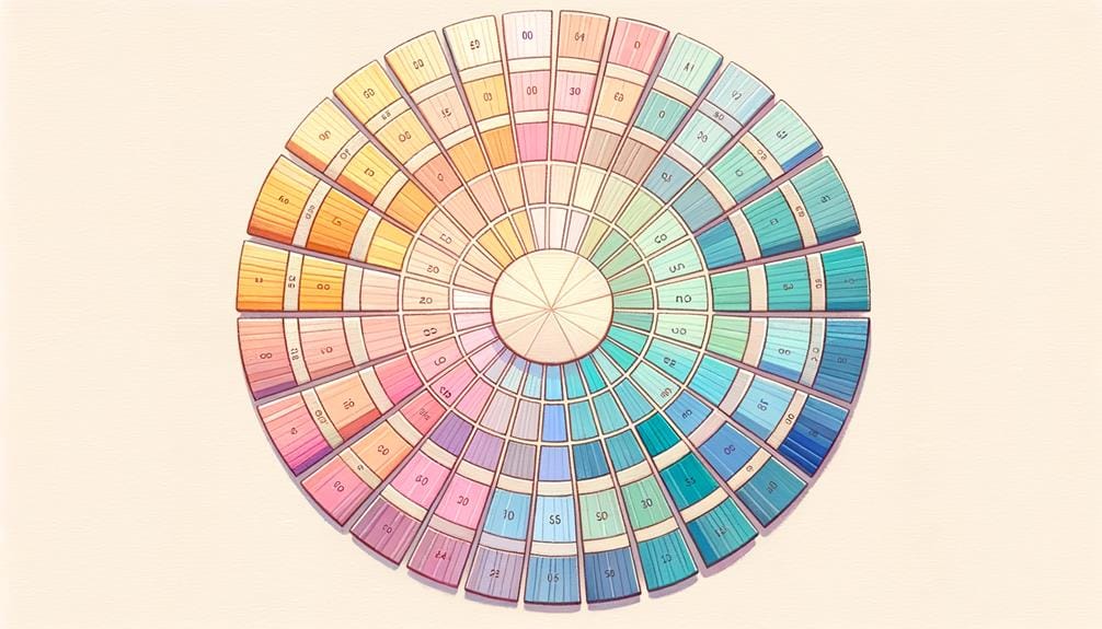
By striking the right balance between primary, secondary, and accent colors, you create a harmonious color palette that captivates your website’s users and effectively communicates your brand’s message. When creating color palettes, consider the 60/30/10 rule: 60% primary color, 30% secondary color, and 10% accent color. This balance guarantees a visually appealing combination that guides user perception.
| Color Theory Principle | Description |
|---|---|
| Complementary Colors | Colors opposite each other on the color wheel, creating contrast and visual interest. |
| Analogous Colors | Colors next to each other on the color wheel, producing a cohesive and harmonious palette. |
| Triadic Colors | Colors equally spaced from each other on the color wheel, resulting in a balanced and vibrant scheme. |
Utilize online tools like Adobe Color Wheel and Coolors to aid in creating a harmonious palette that aligns with your brand messaging. By applying color psychology and color theory principles, you’ll craft a consistent color palette that enhances brand recognition and creates a visually pleasing user experience on your website. This thoughtful approach will elevate your web design and leave a lasting impression on your users.
Enhancing User Experience With Contrast
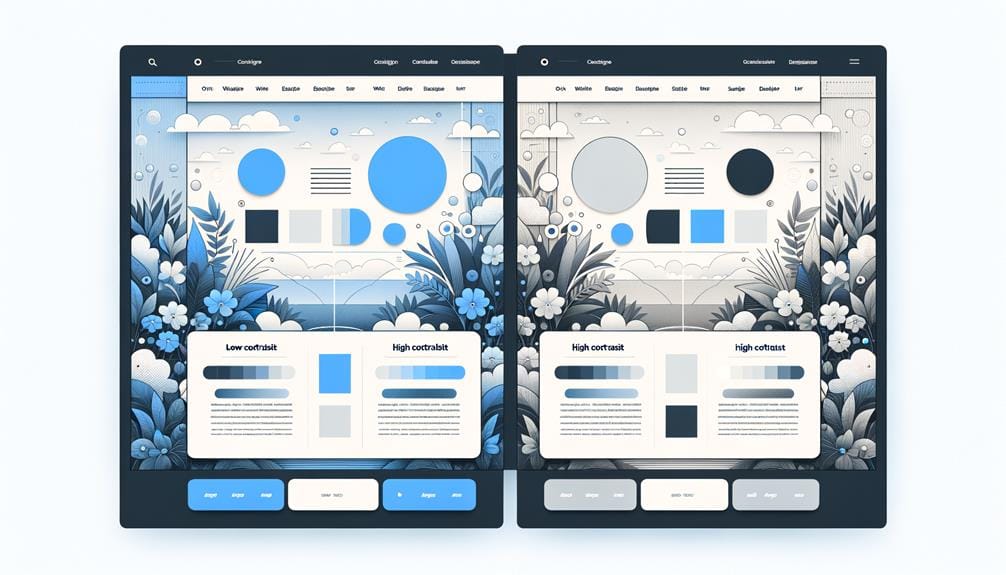
With a harmonious color palette in place, you can now focus on leveraging contrast to create visual hierarchy, draw attention to key elements, and ultimately elevate the overall user experience on your website. Proper color contrast in web design isn’t just an important – it’s a necessity for enhancing readability and accessibility for all users.
By utilizing high contrast between text and background colors, you’ll improve legibility and user engagement. But how do you make sure your design hits the mark? Try testing it in grayscale. This simple trick can help identify areas where contrast needs to be adjusted for better accessibility.
Remember, maintaining sufficient color contrast ensures that important elements stand out and guide user interaction effectively. Effective color contrast is essential for creating a visually appealing and user-friendly website experience. By prioritizing it, you’ll show your users that you’re committed to making your website a pleasure to use.
To Recap
You’ve made it through the top tips for effective color use in web design!
Remember, ‘a picture is worth a thousand words,’ and colors can evoke emotions and convey messages just as powerfully as images.
By establishing a clear visual hierarchy, creating a harmonious color palette, and enhancing user experience with contrast, you’ll be well on your way to crafting a website that resonates with your audience and leaves a lasting impression.

