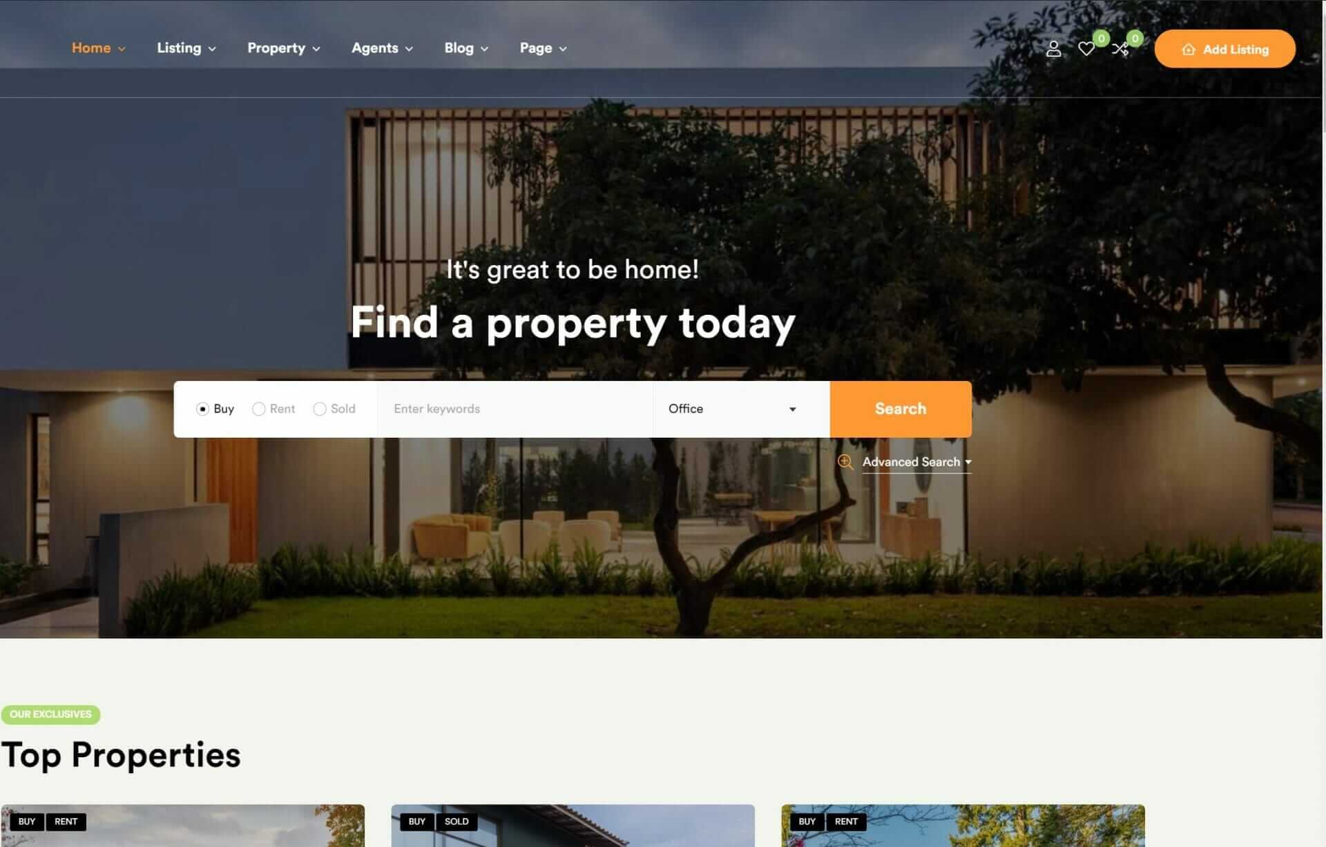
You’re constructing a website that needs to appear visually appealing and function smoothly on various devices, from smartphones to laptops. Responsive web design with HTML and CSS is the answer, enabling your site to adjust its layout and content to various screen sizes and devices. This strategy guarantees a uniform appearance and experience across all devices, enhancing SEO and engagement. By utilizing fluid grids, media queries, and adaptable images, you can develop a user-focused design that improves accessibility and usability. As you delve deeper into responsive design, you’ll uncover methods for enhancing typography, images, and performance to craft a cohesive user experience.
What Is Responsive Web Design
When you build a website, responsive web design is an approach that allows you to create a site that adapts its layout and content to the different devices and screen sizes of your users. You want your website to look fantastic on all devices, and responsive design makes it possible. By leveraging HTML, CSS, and media queries, you can craft websites that automatically adjust to each user’s viewport, resulting in an excellent viewing experience.
With responsive web design, you don’t have to worry about building multiple websites for different devices or screen sizes. One design fits all, as they say. Your users get to enjoy a consistent look and feel, while your website benefits from better engagement and improved SEO. Your layout, images, and content all adjust automatically based on the device being used, ensuring a smooth browsing experience.
The responsive web design approach helps your business reach a broader audience more effectively, ensuring an exceptional user experience. As users switch between devices and devices evolve, responsive design positions your website for adaptability and future growth. Incorporating responsive design empowers your website to maintain cutting-edge functionality, as an essential tool in our age of innovation.
Basic Principles of Responsive Design

Building on the adaptability of responsive web design, you’ll want to understand the basic principles that make it work, starting with the techniques that enable your website to adjust seamlessly to different devices and screen sizes. At the heart of responsive design are fluid grids, which allow your content to flow smoothly across various screens. You’ll also utilize media queries to define breakpoints, where your layout adjusts to accommodate different devices.
| Principle | Description |
|---|---|
| Fluid Grids | Allow content to flow smoothly across screens |
| Media Queries | Define breakpoints for layout adjustments |
| Viewport Meta Tag | Controls the zooming and scaling of pages |
| User-Centric Design | Enhances accessibility and usability |
Using Media Queries Effectively
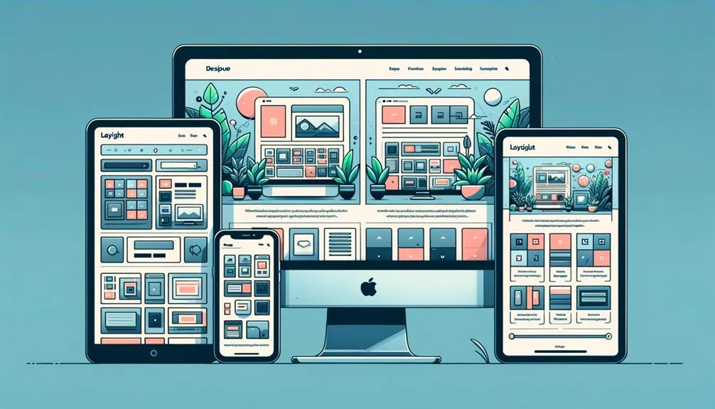
Your responsive design’s effectiveness hinges on mastering media queries, which allow you to apply targeted styles based on various device characteristics. By leveraging media queries in your web design, you create responsive layouts that adapt to different devices, ensuring an optimal user experience. You can apply conditional styling based on screen size, resolution, and orientation, making your design accessible to a broader audience.
When using media queries, you can employ logical operators like AND, OR, and NOT to target specific conditions for styling adjustments. This fine-tuned control enables you to craft adaptive designs that cater to different devices, enhancing user experience and accessibility.
Responsive web design relies heavily on media queries to customize layouts, fonts, images, and other elements based on the viewing environment. By mastering media queries, you can ensure a consistent design across devices, making your website more engaging and user-friendly.
Effective media query usage is essential for creating responsive web design that adapts seamlessly to various devices, so take the time to experiment and find the right balance for your site.
Creating Flexible Grids and Images
As you build responsive websites, you’ll discover that creating flexible grids and images is pivotal for a smooth user experience.
You’ll learn how to design adaptable layouts using relative length units, pre-defined grid classes, and CSS properties that adjust to different screen sizes.
Building Flexible Grid Systems
Creating adaptable grid systems is crucial in responsive web design, allowing you to achieve layout flexibility and consistency across various screen sizes. By using relative units like percentages in HTML and CSS, you can build grids that adapt smoothly to different screen sizes, guaranteeing a consistent design across devices. This flexibility enables content to resize proportionally, maintaining a visually appealing layout.
Here are 4 key benefits of adaptable grid systems:
1. Effortless content resizing:
Your content will automatically adjust to fit different screen sizes, ensuring a smooth user experience.
2. Fluid images:
Images within adaptable grids scale fluidly to fit varying viewport sizes without distortion.
3. Consistent design:
Adaptable grids ensure a consistent design across diverse devices, from smartphones to desktops.
4. Easy maintenance:
With adaptable grids, you can easily update your layout without worrying about breaking the design.
Making Images Responsive Easily
To make images responsive, you’ll want to start by setting their maximum width to 100% in CSS, which allows them to scale proportionally with their container and adapt to different screen sizes. By doing so, you’re ensuring that your images will maintain their aspect ratio, avoiding any pixelation or stretching. This is especially important in responsive web design, where content needs to be easily viewable and accessible on all devices.
Using relative units like percentages or viewport width is key to creating flexible grids that can adapt to varying screen sizes. You can take advantage of CSS frameworks like Bootstrap or Flexbox to simplify the process of creating responsive grids and images. These frameworks offer predefined classes and styles that make it easy to implement responsive design principles.
Scaling Grid Elements
Nearly all responsive web designs rely on flexible grids that use relative units, such as percentages, to scale grid elements based on the screen size of the user’s device.
You create flexible grid layouts with CSS, allowing for dynamic adjustment of column widths and spacing for different devices. This way, your content scales seamlessly across varied screen sizes, maintaining visual consistency.
When you implement responsive images within these flexible grids, they’ll scale proportionally, ensuring an ideal viewing experience. To achieve this, you set `max-width: 100%` for images, making them automatically adjust to the grid’s dimensions.
Here are 4 reasons why scalable grid elements matter:
- Consistency Across Devices: Your content looks great, no matter the screen size.
- Effortless User Experience: Users don’t need to zoom in or out to enjoy your site.
- Improved Conversion Rates: A smooth experience means more engaged visitors.
- Future-Proofing: Your design adapts to new devices and screen sizes, ensuring long-term relevance.
Responsive Typography Techniques
As you build your responsive website, you’ll want to guarantee your typography is just as flexible as your grids and images.
You’ll learn how to use techniques like typography scaling methods and responsive font sizing to create a seamless user experience across various devices and screen sizes.
Typography Scaling Methods
Your responsive web design’s success heavily relies on choosing the right typography scaling methods to guarantee legible and visually attractive text across various devices and screen sizes. Responsive typography is key to a great user experience, and it’s achieved by using relative units like em, rem, vw, vh, and % to scale text sizes. With fluid typography, you can secure that your text is always optimized for the viewer’s screen size.
Here are the benefits of choosing the right typography scaling methods:
- Enhanced readability: Scale your font sizes to secure that your text is always legible, no matter the device or screen size.
- Improved user experience: Responsive typography adapts to different screen sizes, making it easier for users to navigate and engage with your content.
- Increased accessibility: By using relative units and media queries, you can secure that your text is accessible to users with disabilities.
- Seamless visuals: Fluid typography ensures that your text scales smoothly, maintaining a visually appealing design across all devices.
Responsive Font Sizing
To establish an ideal reading experience, you’ll employ responsive font sizing techniques to adapt text size based on the viewport width, leveraging relative units like vw and em to achieve optimal readability. This guarantees your text scales proportionally with the browser width, making it easily legible on various devices. Fluid typography techniques enable text to resize smoothly, preserving aesthetics and readability.
Media queries can be utilized to adjust font sizes at specific breakpoints, guaranteeing uniform typography across devices. You can specify different text sizes for various screen dimensions using viewport units like vw. This allows you to design for specific devices or screen orientations, such as laptops or mobile phones.
The advantages of responsive typography can’t be overstated; by adapting text size to match screen size, you significantly enhance the user’s reading experience. With the wide array of devices on the market, integrating responsive font sizing is crucial to readability in your web design projects.
Best Practices for Responsive Design
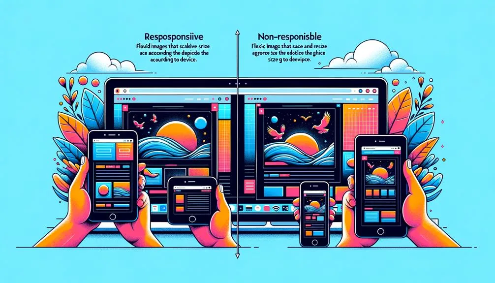
Fluid grids, flexible images, and CSS media queries form the foundation of responsive design, allowing you to create layouts that seamlessly adapt to different screen sizes and devices. By leveraging these techniques, you can guarantee a smooth user experience across various platforms.
To take your responsive design to the next level, consider the following best practices:
- Design mobile-first: Prioritize the mobile experience to guarantee peak performance and usability on smaller screens.
- Test on multiple devices: Verify that your design looks and functions as intended across different devices and browsers.
- Stay flexible: Use fluid grids and flexible images to accommodate varying screen sizes and orientations.
- Optimize for performance: Minimize load times and enhance images to ensure a seamless user experience.
To Recap
You’ve now got a solid grasp of responsive web design with HTML and CSS. As you move forward, keep in mind that 61% of users will leave a site if it’s not mobile-friendly – a statistic that highlights the importance of responsive design.
By applying the principles, techniques, and best practices you’ve learned, you’ll be able to create websites that adapt seamlessly to various devices and screens, ensuring a great user experience and keeping your visitors engaged.


