You can master visual hierarchy in web design by prioritizing elements with size and color, using larger elements and brighter colors to draw attention to critical content. Balance your design with white space to enhance user-friendliness and visual appeal, and guide users with visual cues like arrows and color gradients. Organize your content with grid systems to establish a clear layout, and refine your hierarchy with user testing to validate its effectiveness. By applying these principles, you’ll be well on your way to creating a clear and engaging visual hierarchy – and accessing the full potential of your website’s design.
Prioritize Elements With Size and Color
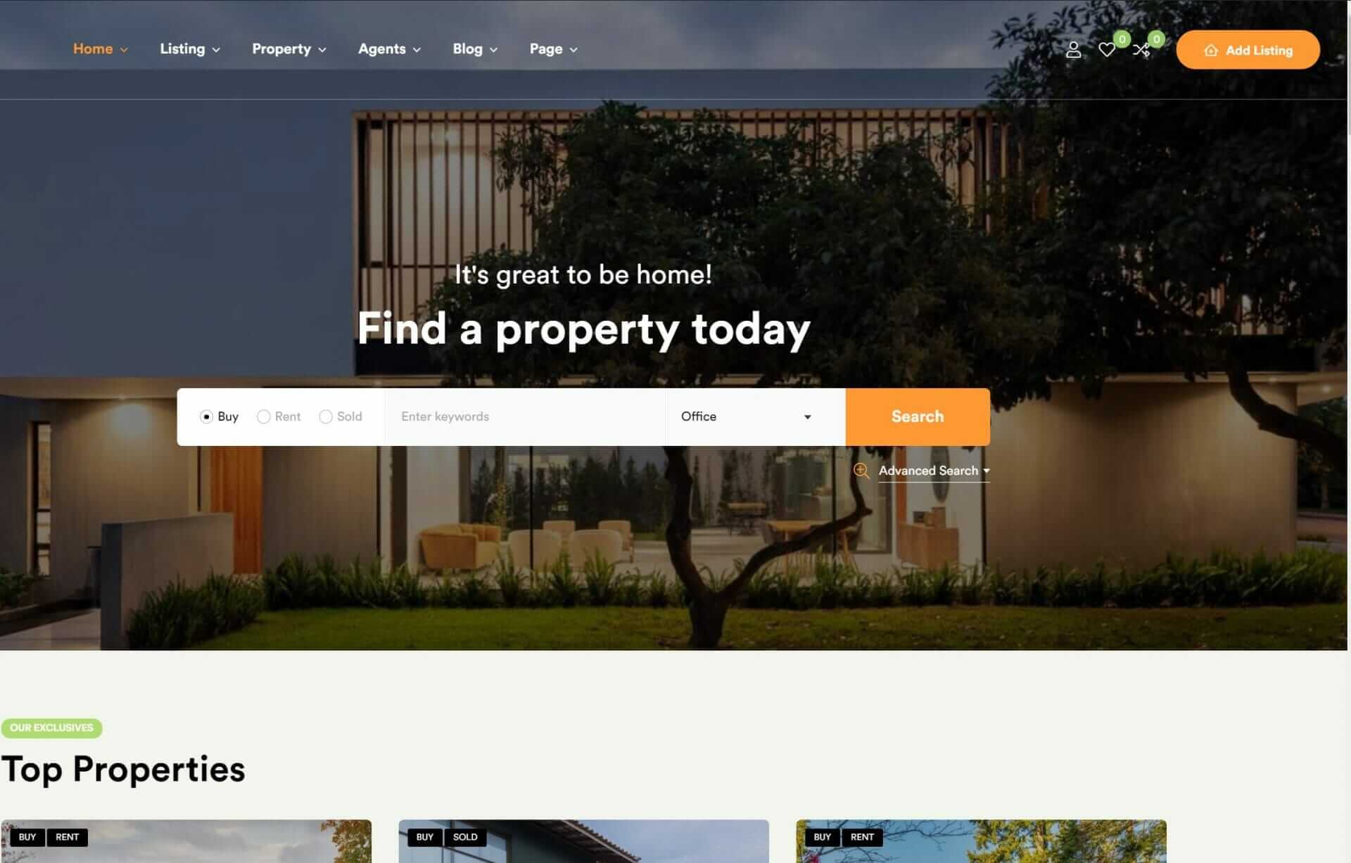
To create an effective visual hierarchy on your website, you prioritize key elements by manipulating their size and color, guiding users’ attention to the most important information. You use larger elements to draw attention to critical content, making it stand out from the rest of the page. Bright colors can also help emphasize key elements and guide user focus effectively. By utilizing contrasting colors, you make important elements pop and improve readability.
Incorporating different font sizes and weights is another way to create a visual hierarchy in text-based content. This technique helps users quickly scan and understand the information on your website.
When it comes to imagery, align it strategically with your website’s message to enhance visual hierarchy and user engagement. By doing so, you create a clear and concise visual design that communicates your message effectively.
Create Balance With White Space

By harnessing the power of white space effectively, you can bring balance and harmony to your website, making it a more inviting and user-friendly space that guides visitors effortlessly through your content. When used strategically, white space can greatly enhance readability and visual appeal, drawing attention to key elements on your website. By including ample white space around text and images, you reduce visual clutter, making it easier for users to digest the information presented. This careful balance not only influences user perception but also guides their focus, ultimately improving their overall user experience.
As you design, remember that white space isn’t merely empty space; it’s a powerful tool in creating a clear visual hierarchy. By allowing important elements to stand out, you direct users’ attention to where it matters most. Therefore, the strategic placement of white space is essential. It’s about finding the right balance that makes your content breathe, making your website a pleasure to explore.
With effective use of white space, you create a harmonious and user-friendly environment that enhances the overall user experience. By embracing white space, you can elevate your web design to the next level of innovation and effectiveness.
Guide Users With Visual Cues

Visual cues play an essential role in directing users’ attention to key areas of your website, helping them navigate and engage with your content more effectively. By incorporating visual cues, you can guide users through your website, increasing user engagement and conversion rates.
| Visual Cue | Description |
|---|---|
| Arrows and Lines | Guide users’ eyes towards important elements on the page |
| Color Gradients | Create depth and draw attention to specific areas |
| Scroll-Triggered Animations | Lead users through sequential information on the page |
| Hover Effects | Indicate functionality and encourage engagement on interactive elements |
Organize Content With Grid Systems

Grid systems act as the foundation of your web design, allowing you to organize your content in a clear, consistent, and logical manner. By using grid systems, you can establish a structure for arranging elements based on columns and rows, resulting in a well-balanced design that’s easy on the eyes.
Maintaining alignment and spacing is crucial for enhancing readability, as they establish a coherent flow for users to follow. This, in turn, helps uphold visual hierarchy and establishes a sense of order on the webpage. Effective utilization of grid systems guarantees a harmonious and visually appealing web design that steers users through your content effortlessly.
By organizing your content layout in this manner, you can present information in a manner that’s both instinctive and captivating. So, invest the time in setting up a sturdy grid system – your users will appreciate the seamless browsing experience, and your design will benefit from a clear and succinct visual language.
With a well-crafted grid system, you’ll be well on your way to mastering visual hierarchy in your web design.
Refine Hierarchy With User Testing

As you refine your design, user testing becomes an essential step in validating the effectiveness of your visual hierarchy and identifying areas for improvement. By observing how users interact with your design elements, you’ll gather valuable insights to refine your visual hierarchy.
Implementing feedback from user testing helps you identify issues and enhance the overall effectiveness of your design.
Here are three key benefits of regular user testing:
- Align with user preferences: Regular testing ensures that your visual hierarchy aligns with user behaviors and preferences, making your design more intuitive and user-friendly.
- Evaluate user actions: By evaluating user actions during testing, you’ll gain valuable insights to optimize your hierarchy and create a more impactful design.
- Iterative improvements: User testing allows you to make iterative improvements, refining your visual hierarchy with each round of testing to create a more effective and engaging design.
To Recap
You might be thinking, ‘I don’t have time to focus on visual hierarchy, I just need to get my website up and running.’ But trust us, investing time in mastering visual hierarchy is essential.
By prioritizing elements with size and color, balancing with white space, guiding users with visual cues, organizing with grid systems, and refining with user testing, you’ll create a website that engages and retains users, driving real results for your business.


