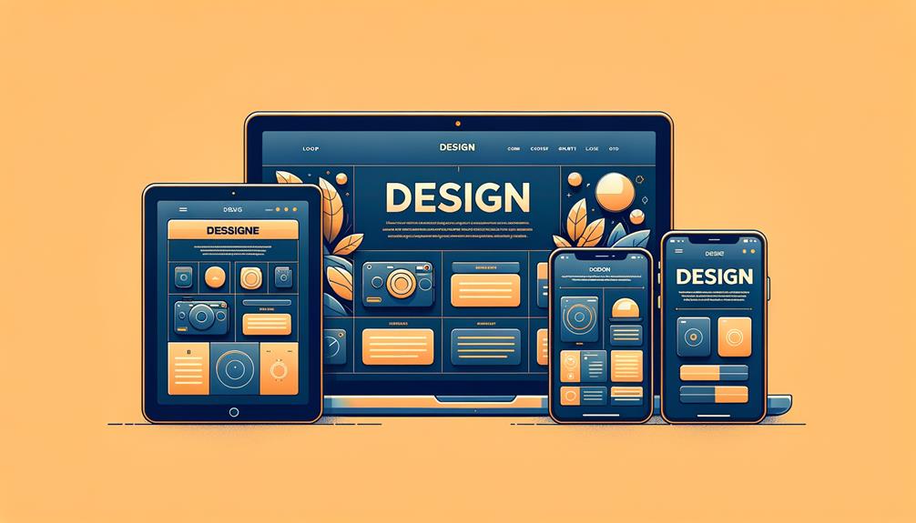
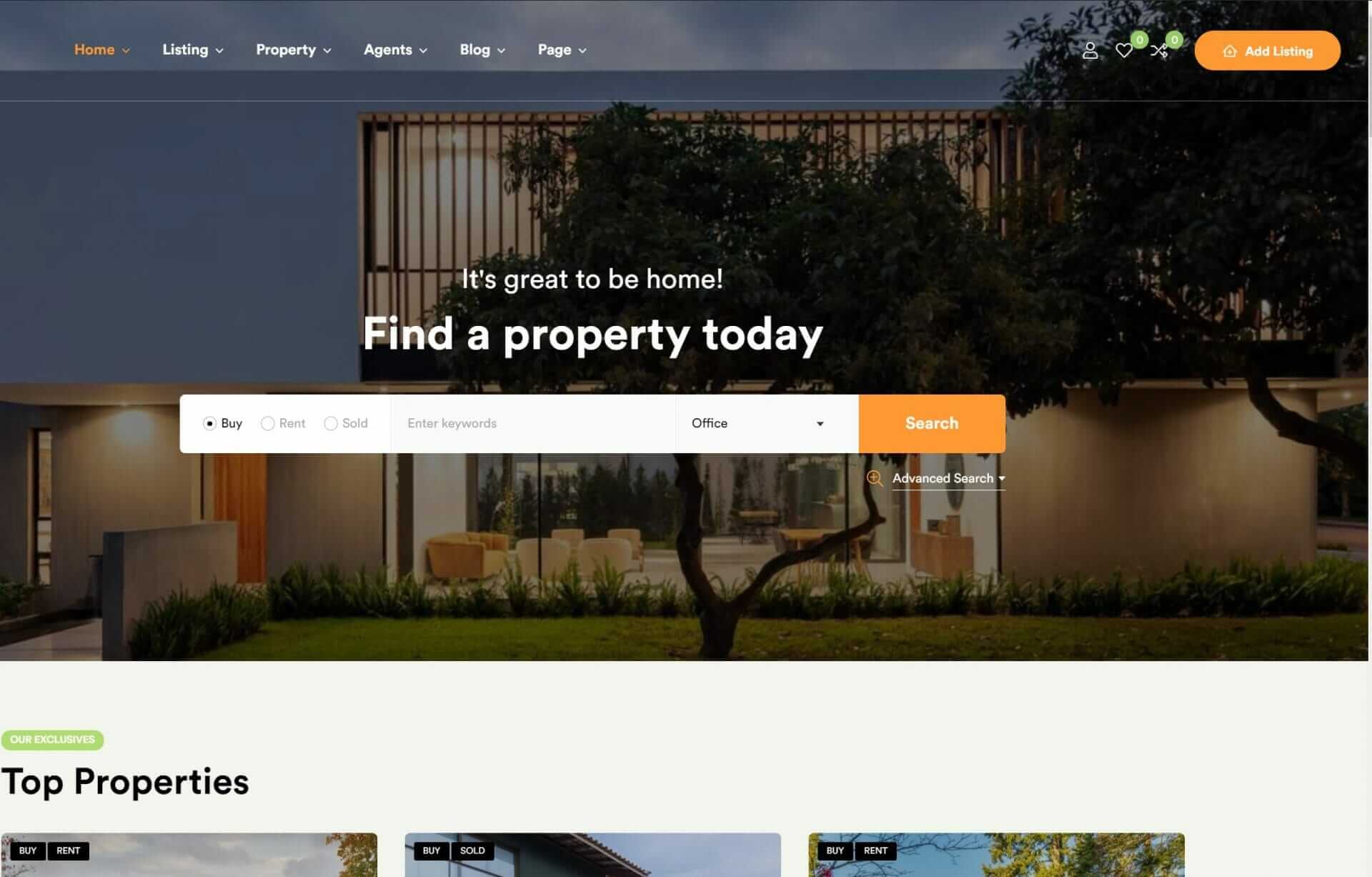
To create a seamless user experience across different devices and screen sizes, you should incorporate top responsive web design best practices into your development workflow. This involves using flexible grid-based layouts and designing for a mobile-first approach, as mobile devices represent more than half of web traffic. You should also eliminate friction on devices by optimizing for fast loading speeds and using responsive design practices. To further enhance user experience, optimize images and media, implement responsive navigation menus, and guarantee consistent user experience across different devices and browsers. By mastering these strategies, you’ll be one step closer to perfecting your responsive design skills.
Utilize Flexible Grid-Based Layouts
When constructing a responsive website, you utilize adaptable grid-based layouts to create flexible designs that adjust seamlessly to various screen sizes. This approach guarantees that your web content is displayed optimally across different devices, providing users with a consistent and engaging experience. By leveraging relative units like percentages, you create a design that’s fluid and responsive. Grid systems such as Bootstrap and Foundation offer pre-defined grid structures that simplify the process of building responsive layouts.
With adaptable grids, your content adjusts dynamically based on screen size, securing a cohesive user experience. Modern tools like Flexbox and CSS Grid offer advanced layout options that further enhance responsive design. By implementing adaptable grids, you optimize content placement and alignment across devices, resulting in a polished and professional design.
Design for Mobile-First Approach

To create a responsive website that meets the needs of modern users, you should adopt a mobile-first approach, prioritizing design elements that cater to smaller screens and touch interactions. This approach is vital, as mobile devices now account for over 50% of web traffic. By designing for mobile-first, you guarantee that your website is optimized for smaller screens, enhancing user experience and usability.
You’ll focus on creating a mobile-friendly layout at the beginning of your design process. This allows you to easily scale up to larger screens, ensuring consistency across devices.
A mobile-first approach also helps you reevaluate content and features, leading to a more focused and user-friendly design.
Eliminate Friction on Devices

Friction on devices is an important obstacle to a seamless user experience, causing frustration and driving users away from your website. When users encounter slow loading times, unresponsive elements, and complex navigation, they’re likely to abandon your site and never come back. That’s why eliminating friction is a top priority in responsive design. By optimizing your site for fast loading speeds, smooth interactions, and intuitive navigation, you can reduce friction and keep users engaged.
To minimize friction, you need to identify the pain points in your website’s user journey. Put yourself in your users’ shoes and experience your site on different devices. Where do you encounter obstacles or frustration? Are there any unresponsive elements or slow-loading pages?
Once you’ve identified these issues, apply responsive design best practices to address them. By doing so, you’ll not only improve user experience but also boost user retention. Remember, mobile users expect seamless experiences, so eliminating friction is vital for keeping them engaged.
Optimize Images and Media

How do you guarantee that your website’s images and media don’t impede the user experience, but instead enhance it, especially considering that they can account for a significant portion of your site’s overall file size?
You start by optimizing your images. Use the appropriate file formats like JPEG, PNG, and SVG for different elements on your website. Then, compress images to reduce loading times and improve site performance, aiming for a balance between quality and file size.
Next, utilize lazy loading techniques to only load images when they enter the viewport, reducing initial load times and improving user experience. Implement responsive image techniques like srcset to serve different image sizes based on device resolution, ensuring the best display on various screens.
Finally, test image optimization across devices and screen sizes to guarantee images display correctly and efficiently on all platforms. By implementing these responsive image techniques, you’ll ensure that your images enhance the user experience, rather than impede it, and that your site performs efficiently across all devices and screen sizes.
Implement Responsive Navigation Menus

Commonly, a well-designed responsive navigation menu is the key to a seamless user experience, providing easy access to your website’s most important features and pages. You want your menu to be user-friendly, with clear labels and intuitive design that makes it easy for visitors to find what they need.
To save screen space on smaller devices, consider utilizing collapsible menus or hamburger icons. This way, your menu is still accessible but doesn’t overwhelm the user.
Sticky navigation bars can also enhance the user experience by keeping important menu options visible as users scroll. When implementing dropdown menus, keep the levels to a minimum to prevent overwhelming users with too many choices.
Another useful feature is back-to-top buttons, which can improve navigation on longer pages by allowing users to quickly return to the top. By incorporating these features, you’ll create responsive navigation menus that aren’t only accessible but also provide an intuitive design that adapts to different screen sizes. This will guarantee a smooth user experience, making it more likely for visitors to engage with your website.
Ensure Consistent User Experience

By designing a responsive navigation menu that adjusts to different screen sizes, you’ve taken the first step in creating a cohesive user experience – now it’s time to guarantee that this experience remains consistent across all devices and interactions.
A consistent user experience is vital for retaining visitors, as 88% of online consumers are unlikely to return to a site after a negative experience. With responsive web design, you can secure a seamless shift between different devices, leading to a 67% higher chance of conversion.
A mobile-friendly design is also essential, as 52% of users say a poor mobile experience makes them less likely to engage with a company. By prioritizing device compatibility, you can increase user engagement, with 74% of users more likely to return to a mobile-friendly site.
Additionally, responsive design leads to better SEO rankings, as Google prioritizes mobile-friendly websites in search results. By following design principles and utilizing responsive breakpoints, you can create a consistent user experience that drives conversion rates and boosts user engagement.
Ensure that your design is optimized for all devices to reap the benefits of a well-crafted responsive web design.
Use Breakpoints and Media Queries

You’re creating a responsive web design, and now it’s time to set up the framework that will make it shine across different devices.
To achieve this, you’ll need to strategically place breakpoints – those critical points where your layout changes to accommodate various screen sizes – and use media queries to apply the right styles for each device.
Optimize Breakpoint Placement
To create a seamless user experience across various devices, you need to strategically place breakpoints in your responsive design, allowing your layout to adapt and thrive on different screen sizes and resolutions.
Well-placed breakpoints are key to make sure that your content displays effectively on various devices, which in turn enhances the overall user experience.
But how do you determine the ideal placement of breakpoints? Here are a few things to take into account:
- Device characteristics: Think about the various devices your users will be accessing your site on, including smartphones, tablets, and desktop computers. What’re their screen sizes and resolutions?
- User behavior: Take into account how users interact with your site on different devices. Do they tend to scroll more on smaller screens or click on larger screens?
Effective Media Query Usage
Strategically employing media queries, designers can create responsive layouts that adapt seamlessly to different devices and screen sizes, optimizing the user experience across various platforms. By setting strategic breakpoints in your CSS, you’ll enable conditional styling to take effect, reshaping your layout to accommodate changing screen sizes. Effective media query usage equips your design with adaptability, ensuring a smooth user experience.
| Screen Size Range | Breakpoint Effect |
|---|---|
| 0 – 479px | Apply mobile-friendly layout |
| 480 – 767px | Adapt layout for tablets |
| 768 – 1023px | Shift to desktop layout |
| 1024 – 1439px | Enhance layout for larger desktops |
| 1440px and up | Optimize for extra-large screens |
To maximize the potential of your responsive design, you need to carefully consider where to place your breakpoints. By doing so, you’ll create flexible layouts that fluidly adapt to diverse devices, enhancing the overall user experience. Media queries are powerful tools in responsive web design; when used thoughtfully, they help designers achieve a seamless, adaptable design that flourishes across a wide range of devices and screen sizes. By mastering media queries, you’ll elevate your design’s user experience and adaptability.
Test for Cross-Browser Compatibility

As you build your responsive website, you’ll want to make sure it works seamlessly across various browsers.
You’ll need to test for cross-browser compatibility to guarantee that your site functions as intended, whether users view it on Chrome, Firefox, Safari, or Edge.
Let’s explore the essentials of browser testing and discuss practical fixes for common compatibility issues, so you can deliver a smooth user experience to your audience.
Browser Testing Essentials
Because your website’s functionality and layout can be affected by browser-specific nuances, testing for cross-browser compatibility is an important step in ensuring a seamless user experience across different browsers.
You can’t assume that your website will work perfectly on all browsers, including Internet Explorer, without thorough testing. Conducting cross-browser testing helps identify and fix any layout or functionality issues that may arise due to browser-specific nuances.
To make browser testing easier, consider using popular tools like:
- BrowserStack: a thorough testing environment for various browsers and devices
- CrossBrowserTesting: a tool that allows you to test your website on multiple browsers and devices
Compatibility Issue Fixes
Now that you’ve set up a thorough browser testing environment, it’s time to address any compatibility issues that may have arisen, so you can guarantee your website provides a seamless user experience across different browsers. To guarantee cross-browser compatibility, you’ll need to test your website on various browsers like Chrome, Firefox, Safari, and Edge.
| Cross-Browser Compatibility Issues | Solutions |
|---|---|
| Layout discrepancies | Use CSS resets and normalize styles to ensure consistent rendering |
| Browser-specific rendering issues | Utilize tools like BrowserStack or CrossBrowserTesting for in-depth testing |
| CSS code inconsistencies | Validate and fix CSS code to prevent display problems |
| JavaScript code inconsistencies | Debug and optimize JavaScript code for smooth functionality |
| Display problems on older browser versions | Monitor and update your website regularly to maintain compatibility |
To Recap
You’ve mastered the top responsive web design best practices! Now, you’re set to create seamless user experiences.
With flexible grid-based layouts, mobile-first approaches, and optimized images, you’ll eliminate friction on devices.
Consistent user experiences, responsive navigation menus, and cross-browser compatibility will become second nature.
By applying breakpoints and media queries, you’ll take your designs to the next level.
As you test and refine, you’ll guarantee a flawless user experience that drives engagement and conversions.


