
With a greater understanding of what is web design, I think it would limit the number of times we speak to different people at our web design agency who want a new web design feeling a little nervous or shy.
It could be a large multinational corporation, an education company, a restaurant, or even a travel blogger; they are all different and have different needs and budgets. One thing that stands out as the most common connection between them all is a slight awkwardness and shyness when speaking with a website designer.
I think web design is still seen as a dark art in some circles :0) At Web Design Saigon, we like to try to support and help and provide information as much as possible even if we don’t win the business, as we believe the more confident people are with web design, the better it is for the industry.
So with that in mind, I would like to provide you with this article to give you an insight into all the information a website designer needs to create a web design or at least the elements surrounding the fundamentals of web design. Once you read this, you will have a good understanding and knowledge to be confident in asking, discussing, and explaining some of the critical requirements needed to build your following beautifully designed website.
So What Is Web Design?
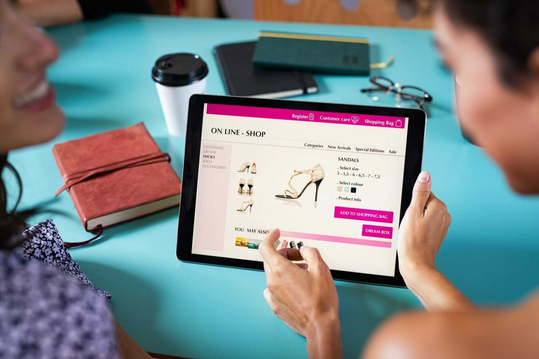
So firstly, let’s understand what web design is. Web Design is the process of designing, conceptualizing, and organizing content online. Designing a website today goes beyond aesthetics to include the overall functionality of the website. Web designers also cover web services, smartphone apps, and the design of user interfaces (UI).
Did you know that web design can have a massive effect on your performance in search engines such as Google? This article will give you some valuable insight into building a website that operates appropriately and ranks highly in searches, not just looks fine.
Finding Some Design Inspiration

Website Designers look around for inspiration; the sites are easily accessible and will help give you ideas to discuss with your web designer. To help get the creative juices going, here are some of the best sites:
The Types Of Platforms A Website Designer Will Use For Your Web Design
You can build a website in three main ways: using a desktop app, a website builder, or our preferred, which is WordPress. Based on your team size, budget, and the type of site you want to create, and its technical specifications, the tool you decide to use can differ significantly.
1. Desktop Apps (Coding)
Desktop applications require web designers to build and submit their designs to a development team, translating the design to code. Photoshop and Sketch are the most popular desktop apps for designing websites.
This is usually the standard for large and complicated websites. It enables the designer to concentrate on the overall look and feel while passing all the technical issues to the production team. Unfortunately, since different resources, skill sets, and team members are required, this process can be costly and time-consuming. Using a website builder to design a website with more minor technical requirements is helpful to avoid involving a developer.
2. Website Builders
There are many website builders on the market today that offer a wide variety of features and services. Wix, Squarespace, Weebly are just a few examples of typical website builders that differ in design capabilities, template choices, price, and overall editing experience. Be sure to do your homework, try free trials, and decide which platform best suits your website’s needs. These tend to be very basic and used for entry-level websites.
3. WordPress
WordPress is the most popular tool for building websites and powers about a third of all websites. Website designers can create websites that are adaptive or sensitive, providing numerous building experiences. It is one reason why our website is built using WordPress at our online marketing agency in Vietnam, and we only work with WordPress for our clients as the possibilities are endless.
To better understand which builders can function for you, We will explore these principles in more depth below.
First, identify your website specifications before speaking to your web Designer about your web design: Are you creating a photo gallery? How much will your site be updated? Need a shop or a way for visitors to contact you? Choose a designer that uses the right tools that can help you achieve your objectives effectively.
Common Elements Used A Web Designer Would Use
It is necessary to consider both the appearance and functionality of the site when designing a website. Integrating such components will help to improve the overall usability and efficiency of the website. Elements such as an easy-to-navigate interface/menu, effective use of graphics and pictures, well-written and well-placed text, and a color scheme are part of the usability of your web. Your site’s success relates to its tempo, rating, searchability, and capacity to capture your audience.
Visual Elements Used In Web Design
To make sure everything fits well together, here’s a short rundown of the visual elements you should consider when creating your website. To help you get started, each section will include tips and tricks.
Written Copy / Copywriting
Fundamentally, the look and text of the website go hand-in-hand. To produce a coherent design with balanced elements, it is essential to have your content writers and Website designers working together. To complement your graphics and pictures, concentrate on creating chunks of text (using text blocks).

Fonts
Pick a font that compliments the overall style of your product or brand. The font should fit your color scheme, graphics, pictures and enhance your website’s overall sound. You can find a perfect match for your font using tools like Canva’s Font Combinator. Other apps, web design resources such as Font Pair also provide a place to see multiple font pairings side by side. Play about it as much as possible to find the one that suits you.

Colours
When designing a website, colors are one of the essential components to remember. Bear in mind that there are many myths about color psychology, and it is more important to concentrate on colors that match your website’s overall design and sound. Connect your color scheme with your brand and the messages to your audience that you want to communicate. Have a look at this detailed infographic.
Design Layout
It will drastically affect your site’s usability and functionality in how you decide to organize your content. There are no clear rules to follow when choosing a layout, but there are a couple of key concepts to bear in mind. Ensure you consider your target audience’s needs and avoid using an over-stimulating structure that could distract from the messages you want to express.

Shapes & Overlays
The use of graphic elements in web design will help combine text and images seamlessly and help with the site’s overall appearance. Combining beautiful colors and shapes will help direct visitors’ attention to your sites and add to your site’s general flow.

Spacing (White Space)
Spacing is a crucial aspect of designing websites that are visually appealing and easy to navigate. In one way or another, every feature in your design will incorporate spacingWhite space’s proper use is essential in developing a template that perfectly blends text, images, and graphics. Keeping your area consistent will make it easy for your users to access your website. The concept of whitespace is undoubtedly a priority of contemporary web designers.

Images (pictures) & Icons
In just a few seconds, striking designs can transmit a lot of data. With the use of solid images and icons, this is made possible. Choose pictures and symbols that support your message and enhance it. Thousands of options will be provided by a fast Google search for stock images and icons. Here are a few favorites to help to ease your search:
Free Image & Icon Resources
Premium Image & Icons
Videos
Among Website designers, incorporating videos into web design is becoming increasingly popular. Videos can help your users experience or comprehend a message that can not be adequately communicated through text or picture when appropriately used. Bear in mind that Videos would draw visitors’ attention to moving images, like getting a TV screen at a restaurant. Make sure that your videos don’t clash with other essential elements or distract from them.
Functional Elements Website Designers Use
When having your website designed, it’s good to note these functional elements are crucial to remember. A website that works appropriately is essential to rank highly on search engines and give your users the best possible experience.
Navigation
Your website’s navigation is one of the key elements that decide if your website is working correctly. Your navigation can serve many purposes depending on your audience: helping first-time visitors explore what your site has to offer, giving easy access to your pages for returning visitors, and enhancing the overall experience of each visitor. For more tips on navigation, check out these best practices.
User Interactions (UI)
Depending on their computer, visitors have several ways to communicate with your site (scrolling, tapping, texting, etc. The best website designs simplify these interactions to give the user the impression that they are in chaos. There are a couple of examples here:
- Never play audio or videos automatically
- Never emphasize text unless it is clickable.
- Ensuring that all forms are mobile-friendly
- Avoid pop ups
- Scroll-jacking stopped
Animations
There are loads of techniques for web animation that can help your design catch visitors’ attention and encourage your visitors to engage with your website by providing feedback. Adding “like” buttons or shapes, for example, will keep visitors to your site engaged. If you’re new to web design, we’d suggest keeping your animations basic to prevent developer interference.

Speed
No one likes a sluggish website. You have to wait for a page to load for more than a few seconds will easily discourage a visitor from continuing or returning to your site. Regardless of how beautiful, it won’t do well in search (i.e., won’t rank high on Google) if your site doesn’t load soon. Usually, top site constructors compress the content for quicker load times, but there are no guarantees. Make sure you investigate which site builders would work best with the content on your site that you will have. For instance, WordPress has many plugins to optimize your images to ensure quick loading times for sites with large and multiple files.
Site Structure
A website’s structure plays an essential role in user experience (UX) and search engine optimization (SEO). Without having any structural problems, your users should be able to navigate through your website quickly. If users are lost when trying to navigate your web, “crawlers” are also likely. A crawler (or bot) is an automated program that searches and can evaluate its functionality through your website. Poor navigation will lead to poor site ranking and user experience.
Compatibility Across Browsers & Devices
A great design should look polished on all devices and browsers (yes, even Internet Explorer). We’d suggest using a cross-browser testing tool to make this tedious process quicker and more effective if you develop your site from scratch. On the other hand, if you use a website building platform, the cross-browser test is usually taken care of by the company’s development team to enable you to concentrate on design.
Website Design Types: Adaptive vs. Responsive
Understanding the advantages and drawbacks of adaptive and responsive websites will help you decide which website builder will best suit your website design needs. You might come across online articles that address many different types of website design (fixed, static, fluid, etc.). However, there are only two website types to build a website properly in today’s mobile-centric world: adaptive and responsive.
Adaptive Web Design
Two or more versions of a website optimized for various screen sizes are used for Adaptive web design. Based on how the site detects what size needs to be shown, adaptive websites can be divided into two major categories:
1. Adapts depending on type of device
When your browser connects to a website, the HTTP request will contain a “user-agent” field that tells the server the type of computer trying to view the page. The adaptive website will know which version of the site is to be considered depending on what computer (i.e., laptop, mobile, tablet) is trying to access it. If you shrink the browser window on a computer, issues will occur because the page will continue to view the’ desktop edition’ instead of shrinking to the new size.
2. Adapts based on width of browser
The website uses media queries (a CSS function that allows a web page to adjust to different screen sizes) and breakpoints (certain width sizes) instead of using the ‘user-agent to move between versions. So you can have models of 1080px, 768px, and 480px widths instead of providing a desktop, tablet, and smartphone edition. When designing, this allows more versatility and a better viewing experience as the website adapts based on screen width.
Responsive Web Design
An experienced website designer can use flexible grid formats based on the percentage and element used in its container for responsive websites. If one component (e.g., a header) is 25 percent of its container, no matter the shift in screen size element will remain at 25 percent. Responsive websites may also use breakpoints to create a custom look at any screen size. Still, responsive websites constantly adapt according to the screen size, unlike adaptive sites that change only when they reach a breakpoint.
Next Steps
So, that was pretty detailed, and congratulations if you managed to read it all. Hopefully, the goals we set o have been achieved, and you are now confident in understanding the mechanics of web design.
So where do you go from here:
- You could use your new-found knowledge to consider trying to build your own website, have a play and a tinker – WordPress is free and can test everything out.
- You have a better understanding of what you are looking for in your new website and are now ready to discuss this will a Website Designer…If so you can start by completing our quote form ;0)