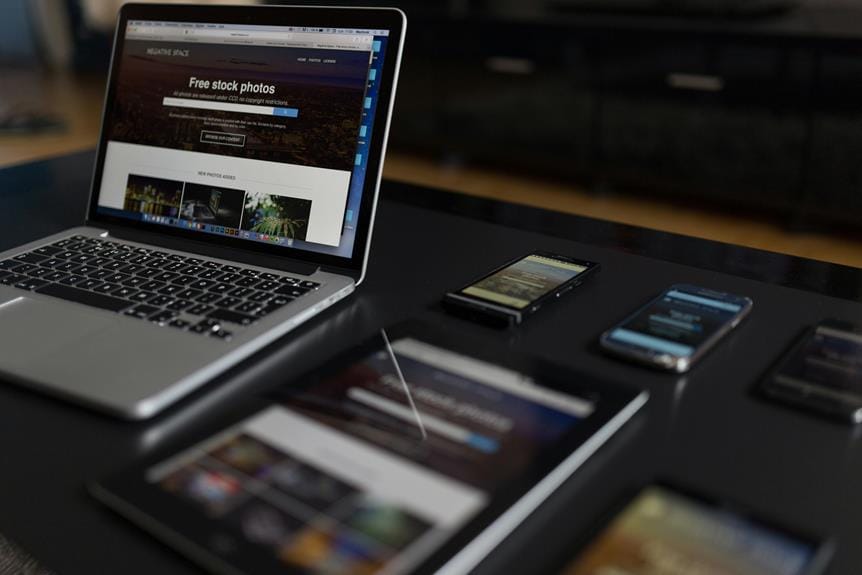
To create a seamless user experience across various devices, prioritize a mobile-first design approach, which optimizes for the majority of users and guarantees a forward-thinking strategy. Next, utilize flexible grids and breakpoints to master responsive design, allowing your layout to adapt based on screen size and resolution. Finally, optimize content and media responsibly by using techniques like compression and lazy loading to reduce loading times and enhance user experience. By implementing these three essential tips, you’ll be well on your way to creating a responsive design that looks great on all devices, and there’s even more to explore to take your design to the next level.
Prioritize Mobile-First Design Approach
By adopting a mobile-first design approach, you guarantee that your website is optimized for the majority of users who access the web through their mobile devices. This forward-thinking strategy prioritizes designing for mobile before scaling up to larger screens, ensuring seamless user experiences across various devices.
With Google’s mobile-first indexing, a mobile-friendly design isn’t just a bonus – it’s a necessity. By focusing on designing for mobile, you’ll reevaluate design elements, content hierarchy, and navigation to create a streamlined experience for users on-the-go.
A mobile-first approach forces you to address usability concerns, optimize for popular screen resolutions, and future-proof your website‘s user experience. By doing so, you’ll not only enhance mobile user experiences but also improve overall performance, leading to better SEO rankings and increased user engagement.
Fluid grids and flexible layouts will become your best friends as you design with viewport width in mind. The end result? A responsive design that effortlessly adapts to the ever-changing digital landscape.
Utilize Flexible Grids and Breakpoints

To create a responsive design that truly adjusts to different screen sizes, you’ll need to master the art of utilizing flexible layouts and breakpoints.
Flexible layouts allow elements to adapt and reflow based on screen size and resolution, guaranteeing that your design looks great on various devices.
Breakpoints are specific points in the layout where design changes occur to accommodate different screen sizes. By utilizing media queries at these breakpoints, you can define CSS rules for styling elements at various screen widths, creating a seamless user experience.
Implementing flexible layouts and breakpoints is essential for creating an adaptable design that responds to different devices. This approach enables you to optimize your design for various screen sizes, guaranteeing that your content is easily accessible and visually appealing.
By strategically using breakpoints, you can guarantee that your responsive design provides an excellent user experience on different devices.
Optimize Content and Media Responsibly

Now that you’ve mastered flexible grids and breakpoints, it’s time to focus on optimizing your content and media to guarantee they load quickly and display perfectly on various devices.
You’ll want to start by optimizing your images using responsive image techniques, ensuring they remain clear and load fast on different devices. Don’t forget to prioritize adaptive content resizing and rearranging elements to maintain responsiveness across various screen sizes.
To further improve performance, utilize compression techniques for images to reduce loading times on different devices. Then, implement lazy loading strategies for non-vital images and videos to enhance functionality and user experience.
To Recap
You’ve made it to the finish line, and your responsive design is ready to shine! Picture a seamless user experience, where your site adapts effortlessly to every screen size and device.
By prioritizing mobile-first design, utilizing flexible grids and breakpoints, and optimizing content and media responsibly, you’ve created a masterpiece that will leave users impressed.
Your hard work will pay off, as your site responds beautifully to every interaction, engaging your audience with its flawless functionality.