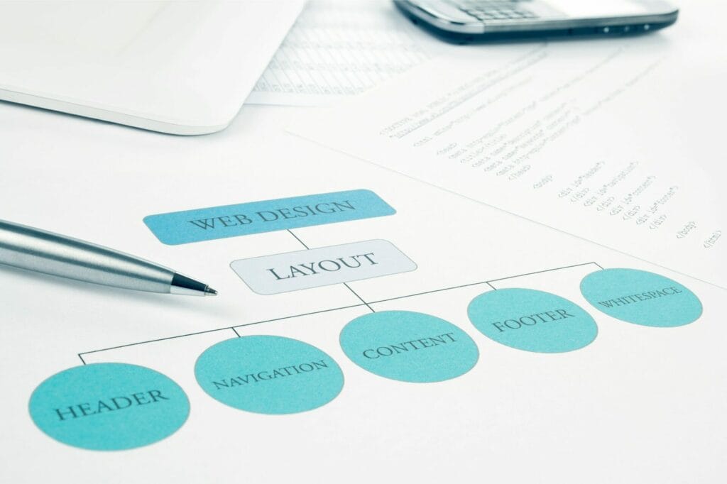
You’re designing a website, and you want to know the role of hierarchy in web design. Well, hierarchy plays an essential role in guiding users’ attention through a thoughtful arrangement of visual elements, such as size, color, typography, and layout. By establishing a clear structure, you’ll enhance usability and engagement. Think of it as creating a clear visual flow, organizing elements by importance, and using typography, color, and alignment to direct users’ eyes. By mastering hierarchy principles, you’ll create a website that’s both visually appealing and easy to navigate. Discover how to put these principles into action.
Fundamentals of Visual Hierarchy Design
By establishing a clear visual hierarchy, you effectively lead users’ attention through your website, organizing elements to convey significance and relevance. This is vital for an effective web design, as it enables users to quickly scan and comprehend the content. You establish a visual hierarchy by leveraging key elements such as size, color, alignment, and typography. The Gestalt principles also come into play, helping users perceive and group visual elements in a logical layout. These principles of visual hierarchy allow you to create a structure that directs user interactions, enhancing their overall experience.
A well-designed visual hierarchy is necessary for any website, as it enables users to navigate the content more efficiently. By drawing attention to essential elements, you make sure that users focus on the most significant information. The Z pattern and F pattern are two commonly used layouts that help guide user attention.
Hierarchy Principles in Web Typography
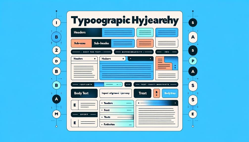
How do you create a clear visual hierarchy in your website’s typography to guide users through the content and enhance their overall experience?
The answer lies in applying hierarchy principles to your typography choices. In web design, typography hierarchy is all about selecting the right fonts, sizes, and styles to establish a clear visual hierarchy. Font pairing plays a pivotal role in creating contrast and emphasis within your typography hierarchy. By choosing the right font combinations, you can draw attention to important information and create a cohesive look.
When it comes to creating a clear hierarchy, larger and bolder typefaces are typically used for headings and important information. Consistent typography choices help maintain a cohesive visual hierarchy and improve readability for users.
Creating Effective Typographic Hierarchy
As you’ve established a solid foundation in web typography, you can now focus on crafting a clear typographic hierarchy that directs users’ attention and engages them with your content. A well-designed typographic hierarchy organizes text elements based on importance, creating a visual flow that guides users through your website. By using variations in font size, weight, and style, you can create a clear hierarchy that improves readability and user engagement.
| Typographic Hierarchy Element | Description |
|---|---|
| Headings | Large font size, bold weight, and distinctive style to grab attention |
| Subheadings | Smaller font size, regular weight, and standard style to provide supporting information |
| Body Text | Standard font size, regular weight, and simple style to convey detailed content |
Consistency is key when designing a typographic hierarchy. By using a consistent font family, spacing, and styling throughout your website, you can create a cohesive look that enhances the user experience. A clear and consistent typographic hierarchy will guide users through your content, improving readability and user engagement. By prioritizing importance and using variations in font size and style, you can create an effective typographic hierarchy that elevates your website’s overall design.
Typography Size and Scaling Rules

With the foundation of a well-designed typographic hierarchy in place, you can now turn your attention to the pivotal role that typography size and scaling rules play in effectively guiding users through your content.
Typography size is an essential element in establishing a clear visual hierarchy, as it helps determine the importance of text elements on a web page. By using varying font sizes, you can create a hierarchy within your text-based content that draws attention to key information and signifies its significance to users.
When it comes to scaling rules, there are a few key principles to keep in mind:
- Larger font sizes draw more attention: Use larger typography to highlight significant information, such as headings and calls-to-action.
- Proper scaling ensures readability: Make sure font sizes are adequate for users to read comfortably, without overwhelming the page.
- Consistency is key: Establish a uniform scaling pattern to maintain a clear hierarchy and enhance the overall user experience.
Color and Contrast in Typography
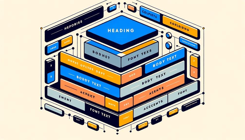
You’re now ready to add another vital layer to your web design’s hierarchy: color and contrast in typography.
By thoughtfully choosing your typography’s color scheme, you can evoke the right emotions and reinforce your brand’s identity, all while guiding users’ attention to key information.
As you explore the interplay between colorful font pairing options, contrast for readability enhancement, and typography color schemes, you’ll discover how to create a visually stunning and user-friendly hierarchy that sets your website apart.
Colorful Font Pairing Options
Selecting the right colorful font pairing options is essential in web design, as it enables designers to create a clear visual hierarchy and draw users’ attention to specific elements through deliberate color and contrast choices.
By combining bold and vibrant colors in typography, you can create visual interest, guiding users’ focus and enhancing readability.
Here are three ways colorful font pairing options can elevate your web design:
- Contrasting hues: Pairing fonts with contrasting hues creates visual hierarchy, allowing users to distinguish between different sections or elements on a webpage.
- Saturation levels: Carefully balancing saturation levels between font pairs can evoke specific emotions or convey brand personality effectively.
- Typography harmony: Combining fonts with harmonious typography creates a cohesive and visually appealing design that captures users’ attention.
Contrast for Readability Enhancement
Building on the principles of diverse font pairing options, effective utilization of contrast in typography allows you to establish a clear visual hierarchy that captures users’ attention and improves readability.
By distinguishing text through color and contrast, you enhance the overall user experience and increase the scannability of your content. Significant contrast between text and background plays a pivotal role, as it assists users in swiftly scanning and comprehending content.
Proper color selections in typography enhance the overall visual attractiveness and efficiency of your website. When applied appropriately, color can direct users’ focus towards essential information, simplifying their search process.
In web design, striking the correct balance between color and contrast is vital for creating a cohesive visual hierarchy. By achieving this, you can develop a website that isn’t only visually appealing but also user-friendly.
Typography Color Schemes
As you explore typography color schemes, establishing a cohesive color palette is important for creating an effective visual hierarchy that guides users’ attention and enhances the overall readability of your website.
When it comes to color and contrast in typography, you want to make sure you’re using them to highlight important text elements on your webpage. Bright colors can attract attention to headlines or key information within the content, while proper color schemes improve readability and user engagement.
Here are three key considerations for typography color schemes:
- Contrast is key: Guarantee that your text color and background color have sufficient contrast to make your content easily readable.
- Use bright colors strategically: Bright colors can be effective for drawing attention to important information, but use them judiciously to avoid overwhelming the user.
- Consistency is important: Establish a consistent color scheme throughout your website to create a cohesive visual hierarchy and enhance user engagement.
Aligning Text for Readability
Now that you’ve grasped the principles of color and contrast in typography, it’s time to explore another vital aspect of web design: aligning text for readability. By understanding the significance of text alignment, you’ll be able to create a clear visual hierarchy on your website, making it easier for users to scan and engage with your content.
In this section, we’ll cover the best alignment practices and share actionable tips on enhancing readability, helping you take your web design skills to the next level.
Importance of Text Alignment
Your choice of text alignment plays a crucial role in determining the readability of your website’s content. Proper text alignment enhances readability by creating a clear visual structure for content on a webpage.
When you align text left, center, right, or justified, it affects how users perceive and engage with information. To maintain a professional look, it’s vital to keep your text alignment consistent throughout your website.
Here are three key considerations for text alignment:
- Justified text can be problematic: While it might look neat, justified text can sometimes lead to uneven spacing between words, which negatively affects readability.
- Center-aligned text draws attention: Use center-aligned text for headings or short blocks of text to create visual interest and draw users’ attention.
- Consistency is key: Maintain a consistent text alignment throughout your website to create a cohesive and professional look that reinforces your hierarchy.
Best Alignment Practices
When designing for readability, using a consistent text alignment strategy is essential to guide users through your website’s content and reduce cognitive load. Proper alignment improves readability by creating a clean and organized layout that users can follow easily.
While justified alignment creates a formal and structured look, left-aligned text is generally easier to read and navigate. Consistent alignment throughout your website maintains a cohesive visual hierarchy, making it intuitive for users to navigate through the information.
To add emphasis or draw attention, consider using center alignment sparingly. However, use this alignment technique judiciously, especially when it comes to large blocks of text, as it may cause readability issues.
You should prioritize an alignment approach that supports a well-organized layout. The effectiveness of your design is strongly connected to readability and clarity, which will directly contribute to the reduction of your user’s cognitive load while increasing their satisfaction and general interaction with the platform and with your company, ensuring alignment is fundamental.
Align text effectively and establish consistent and well-executed solutions across your content presentation approach for a highly digestible presentation.
Enhancing Readability Tips
Building on a solid alignment strategy, you can further enhance readability by applying a few key techniques that cater to how users naturally process and absorb content.
In web design, a well-crafted visual hierarchy is essential for guiding users through your layout. By using consistent text alignment, you can create a cohesive and professional look that aids in user comprehension.
Here are three vital techniques to boost readability:
- Left-align text for natural flow: Since English content is read from left to right, left-aligned text is easier to scan and understand.
- Justify text for clean layouts: Justified text can create a clean and organized appearance, making it perfect for easy scanning and reading.
- Use center-alignment for visual interest: Center-aligned text can add visual interest, but use it sparingly, as it may be harder to read in long paragraphs.
Typography and Repetition Techniques
Typography plays an important role in establishing a clear visual hierarchy on a website, drawing users’ attention to key content and guiding them through the information with carefully selected fonts and text styles. By choosing the right typography, you can effectively communicate your message, establish a strong brand identity, and influence user behavior.
Using different font sizes and styles, you’ll emphasize important information and create a clear reading order that engages users.
Combine your typography skills with repetition techniques, which involve consistently using design elements, such as colors, shapes, or patterns. Repetition reinforces branding and helps users recognize key information, so your overall design feels cohesive and organized.
By employing both techniques, you establish a solid foundation for readable and effective website design.
Ultimately, leveraging typography and repetition is fundamental to making a compelling design that users want to spend time viewing. User experience improves exponentially with text content that aligns beautifully within a greater design environment – and more user interaction happens as user satisfaction progresses over time to develop, reflecting positively across website consumption indicators.
Using Proximity to Enhance Typography

By strategically placing text elements in close proximity to each other, you can visually establish relationships between them and reinforce your typography’s effectiveness. This technique helps create a clear hierarchy in your typography, making it easier for users to navigate and understand the content on your webpage.
When you group related text elements together, you’re signaling to your audience that they’re connected and equally important.
Here are three ways proximity can enhance your typography:
- Headings and subheadings: Placing headings and subheadings near each other creates a clear visual relationship, making it easier for users to scan and understand your content.
- Consistency: Using consistent spacing and grouping throughout your webpage helps establish a visual rhythm, making your typography more readable and engaging.
- Visual appeal: By balancing text elements with white space, you can create a visually appealing design that draws users in and encourages them to explore your content.
Best Practices for Typographic Hierarchy
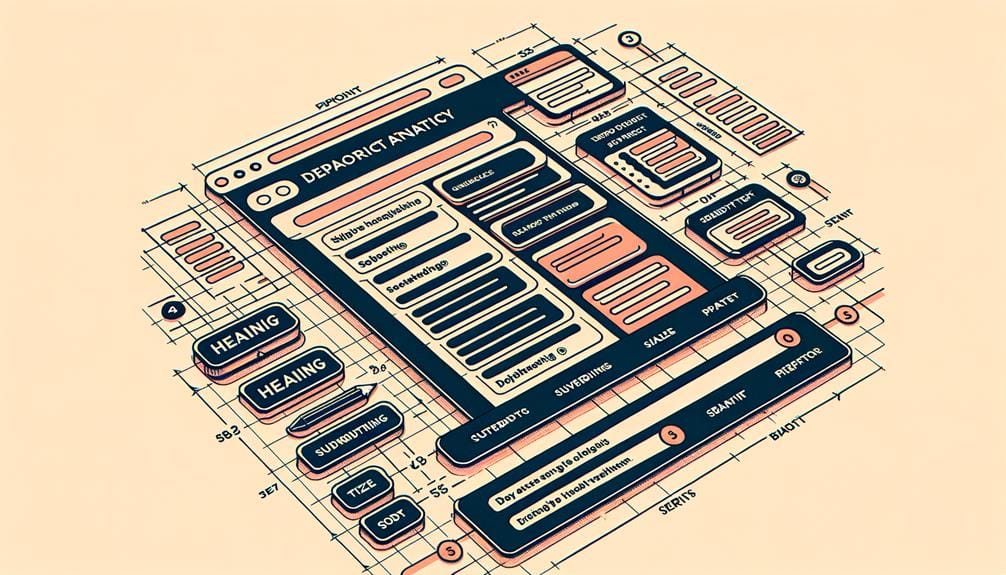
As you work on perfecting the typographic hierarchy of your website, you’ll want to focus on creating a clear visual flow that guides your readers’ attention.
You’ll achieve this by making intentional decisions about font size, line spacing, and color contrast, all of which play an essential role in establishing a harmonious hierarchy.
Font Size Importance
Generally, when creating a typographic hierarchy, you set the stage for effective communication by using font size to guide users’ attention to key information on a webpage. By varying font sizes, you prioritize content and create a clear visual hierarchy, making it easier for users to scan and navigate the page. Larger text indicates importance, while smaller text provides supporting details.
When it comes to font size importance, here are three key considerations:
- Consistency is key: Establishing a consistent font size hierarchy improves readability and user understanding of content structure.
- Headings and subheadings matter: Properly sized headings and subheadings enhance the visual hierarchy, making it easier for users to scan and navigate the page.
- Choose font sizes wisely: Select font sizes based on content significance to create a cohesive and engaging user experience in web design.
Line Spacing Techniques
You can greatly improve readability and visual hierarchy in typography by employing effective line spacing techniques that enhance text legibility and create a balanced design aesthetic. By making thoughtful line spacing adjustments, you’ll help your audience navigate and engage with your content more easily. In web design, achieving best readability is essential, and line spacing plays a significant role in this pursuit.
A general rule of thumb is to set your line spacing to 120-145% of the font size. However, this can vary depending on the font style and your desired design aesthetic. Consistent line spacing helps establish a clear visual hierarchy, preventing your text from appearing cluttered and disorganized.
When done correctly, line spacing enhances the overall typographic hierarchy, making it easier for users to scan and comprehend your content.
Color Contrast Effects
Creating an effective typographic hierarchy relies heavily on selecting the right color contrast, which plays a pivotal role in directing user attention, enhancing readability, and shaping the overall visual aesthetic.
You want to strike the perfect balance between making your text stand out and avoiding visual overload.
Here are three key considerations for mastering color contrast in your typographic hierarchy:
- High contrast is key: Guarantee adequate contrast between your text and background to make your content easily readable. This is especially important for body text, where readability is paramount.
- Complementary colors can harmonize: Choose colors that complement each other, creating a visually appealing combination that enhances your overall design. This can help draw attention to specific elements, like headings or calls-to-action.
- Consistency is essential: Maintain consistent color contrast throughout your hierarchy to establish a cohesive look and feel. This will help guide user attention and create a more immersive experience.
Balancing Typography With White Space
Typography and white space form a delicate balance that can make or break the readability and aesthetic appeal of a web design. When you balance typography with white space effectively, you create a harmonious layout that guides users’ focus through your content.
White space provides breathing room around typography elements, enhancing readability and preventing visual clutter. This, in turn, improves the overall user experience.
Proper spacing between typography elements and white space helps differentiate content sections, making it easier for users to navigate your site. Strategic use of white space around typography also enhances the aesthetic appeal and legibility of the design.
To Recap
You’ve woven a tapestry of typography and hierarchy, carefully balancing each thread to create a cohesive and harmonious design. Your mastery of size, color, contrast, and repetition has orchestrated a visual symphony that guides the user’s eye with ease.
As you continue to hone your craft, remember that a well-crafted hierarchy is the backbone of effective web design, elevating your message and enchanting your audience with every carefully considered detail.

