When designing a responsive website, your typography choices play a vital role in guaranteeing that your content is not only visually appealing but also easily consumable across various devices and screen sizes. You’ll want to select fonts that are clear and easy to read, like Arial, Verdana, or Open Sans, and opt for font sizes of 16px or larger to secure readability. By creating a visual hierarchy and using responsive typography techniques, you can guide users’ attention and enhance their experience. As you explore the significance of typography in responsive web design, you’ll discover more ways to balance form and function.
Selecting Fonts for Readability
When designing a responsive website, you need to select fonts that prioritize readability, as they’ll greatly impact how easily users can consume your content on various devices. In the domain of typography, font choice plays an essential role in responsive web design. You’ll want to opt for fonts that are clear and easy to read, such as Arial, Verdana, or Open Sans, which are popular choices due to their sans-serif styles. Serif fonts, on the other hand, can be less legible on smaller screens, so it’s best to avoid them for body text.
When it comes to font sizes, aim for 16px or larger for body text to guarantee readability on various devices. Don’t forget to adjust line spacing, also known as leading, to enhance readability on different screen sizes. By making these adjustments, you’ll create a more readable and user-friendly experience. Additionally, selecting fonts with varying weights and styles will help create visual hierarchy, making it simpler for users to navigate your content.
Creating Visual Hierarchy
As you work on creating a visual hierarchy in your responsive web design, you’re organizing content to guide users’ attention effectively. By using typography principles like font size, weight, and color, you can prioritize information and make it simpler for users to navigate and comprehend your content on different screen sizes.
Now, let’s explore the key points of creating a clear visual hierarchy, starting with how to organize content effectively and guide user attention.
Organizing Content Effectively
Your website’s visual structure acts as the foundation of efficient content organization, guiding users’ attention through a distinct arrangement of typography, size, and color that distinguishes crucial information from secondary elements.
By prioritizing elements based on importance, you establish a responsive web design that enhances user experience. Typography plays a pivotal role in this process, utilizing font sizes, weights, and colors to create a clear visual hierarchy.
When organizing content effectively, you’re directing users’ focus on the most vital information. A well-organized visual hierarchy helps users navigate and comprehend your content effortlessly. This clarity leads to enhanced engagement and communication, as users can quickly grasp the primary points.
Additionally, a successful visual hierarchy ensures that your message isn’t lost in clutter, but instead stands out through thoughtful typography choices.
Guiding User Attention
By establishing a clear visual hierarchy through typography, you can effectively guide user attention to the most significant elements of your content. In responsive web design, typography plays an essential role in creating this hierarchy, making it easy for users to navigate and focus on key information. You’ll want to use typography to create contrast, making your headings stand out from the rest of your content.
Here are some ways you can use typography to direct user attention:
- Use heading tags (H1, H2, H3, etc.) to create a clear structure and signal the significance of different content sections.
- Employ font weight variations to add emphasis and create visual interest.
- Maintain consistent typography across devices to provide a seamless user experience.
- Balance font sizes and line heights to improve readability and flow.
Best Typography Practices for Accessibility

To create an inclusive reading experience, you need to implement typography practices that cater to users with varying abilities and needs.
When it comes to typography in web design, ensuring readability is key to achieving accessible typography. You can start by using sufficient color contrast and appropriate font sizes, allowing users to easily read and understand the content.
Accessibility guidelines, such as those outlined in WCAG, provide specific recommendations for creating accessible typography.
Responsive Typography Techniques
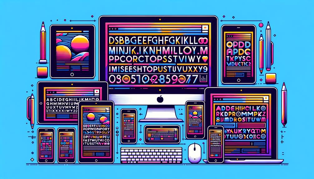
Adapting typography to various devices and screen sizes is a critical aspect of responsive web design, as it guarantees that the visual hierarchy and readability of the content are preserved. You can achieve this by implementing responsive typography techniques that adjust font sizes based on the viewport width.
Here are some innovative techniques to help you create fluid typography:
- Use fluid typography to adjust font size based on viewport width, enhancing readability on various devices.
- Leverage Media Queries to adapt font sizes to different screen sizes for a seamless user experience.
- Employ relative units like em and rem to facilitate scalable typography across devices.
- Implement modular scales to ensure consistency in typography sizing at different breakpoints.
Typography for Enhanced User Experience

What role does typography play in shaping the user experience, and how can you harness its power to elevate your website’s usability and accessibility?
As a web designer, you know that typography plays an essential role in design, and implementing fluid typography is key.
With the vast array of screen sizes out there, your typography must adapt seamlessly to guarantee excellent readability.
Balancing Typography and White Space

As you design your responsive website, you’re probably thinking about how to make your typography shine – but have you considered the essential role white space plays in balancing it out?
By carefully calibrating the size and placement of your typography in relation to the surrounding white space, you can create a harmonious visual hierarchy that guides users through your content with ease.
Now, let’s explore the key considerations for balancing typography and white space, including the importance of typography size and the interplay between visual elements.
Role of White Space
Your typography’s effectiveness is greatly dependent on the strategic use of white space to create a balanced and harmonious visual experience. In web design, white space refers to the empty space between text, images, and other elements on a webpage.
By balancing typography with white space, you enhance readability by preventing content from feeling cluttered or overwhelming.
Here are some key benefits of using white space effectively in your web design:
- Improves visual hierarchy and guides users’ focus on key information
- Reduces cognitive load and enhances content legibility
- Creates a clean, modern design that’s visually appealing and easy to navigate
- Enhances readability by preventing content from feeling cluttered or overwhelming
Typography Size Considerations
Balancing typography size with white space is significant for achieving best readability and visual appeal on responsive websites, where screen sizes and devices can vary greatly. When you’re designing a responsive website, you want to make sure your text is legible and easy to read on any device. That’s why finding the right balance between typography size and white space is essential.
| Screen Size | Font Size | White Space |
|---|---|---|
| Small (mobile) | 16px – 18px | 1.5x – 2x line height |
| Medium (tablet) | 18px – 22px | 2x – 2.5x line height |
| Large (desktop) | 22px – 26px | 2.5x – 3x line height |
| Extra Large (large desktop) | 26px – 30px | 3x – 3.5x line height |
Balancing Visual Elements
When designing responsive web layouts, you’ll need to strike a harmonious balance between typography and white space to create a visually appealing and readable design. This delicate balance is essential for engaging your users and effectively conveying your message.
To achieve this equilibrium, consider the following:
- Proper white space around text elements enhances readability by reducing visual clutter.
- Typography and white space work together to establish a clear visual hierarchy on your website.
- Strategic use of white space around typography improves user experience and comprehension.
- A balance between typography and white space ensures a harmonious and engaging design for responsive web layouts.
Adapting Typography for Screen Sizes
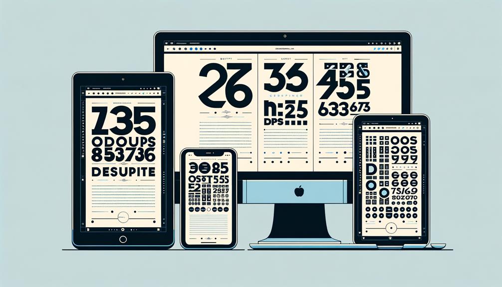
Effective typography in responsive web design begins with adapting font sizes, spacing, and line height to various screen sizes to maintain best readability.
You need to guarantee that your typography is fluid, meaning it adjusts dynamically based on screen dimensions. To achieve this, you’ll use relative units like em and rem, which allow for consistent scaling across different devices.
Media queries will become your best friend, as they enable you to make specific adjustments based on viewport width and device characteristics.
To Recap
You’ve made it through the world of responsive typography, and now you know why it’s essential for a seamless user experience.
Intriguingly, a study by Smashing Magazine found that 95% of a website’s information is communicated through typography.
By choosing the right fonts, creating a clear visual hierarchy, and adapting typography for various screen sizes, you can greatly enhance the readability, accessibility, and overall flow of your website.
Effective typography is key to making your site truly shine.


